CX.AI -Experience the new generation of CX Insights

All Posts By

Lilla Szücs

How To Size The Fiscal Impact Of NPS?

How To Size The Fiscal Impact Of NPS?

Founder of CX-AI.com and CEO of Success Drivers
// Pioneering Causal AI for Insights since 2001 //
Author, Speaker, Father of two, a huge Metallica fan.

Author: Frank Buckler, Ph.D.
Published on: September 20, 2021 * 7 min read

It would be best to use modeling to measure the fiscal impact as it greatly affects customer loyalty. Increase the amount of money each customer spends with your business. This way, you can generate positive word-of-mouth about your business.

Do you know how to increase the fiscal impact? Expecting a great product or service without excellent customer service is like expecting your beautiful garden flowers to flourish without giving attention to them. You can increase your fiscal impact by adopting the following two methods:

  • You need to be consistent in your service delivery
  • You need to encourage your customers to complain

You know that NPS measures the customers’ loyalty and how likely they will refer your products and services to others. It also helps to identify the promoters and detractors of your business. If NPS is so important, you should know how to measure it.

Get your FREE hardcopy of the “CX Insights Manifesto”

FREE for all client-side Insights professionals.
We ship your hardcopy to USA, CA, UK, GER, FR, IT, and ESP.

Why Do We Need Modeling To Measure NPS Impact?

In the earlier blog, we discussed the simulator where you can put in the fiscal impact of one person if you improve the NPS by one point. You can see the improvement in the customer value when you improve the NPS point. 

You cannot simply look at the correlation between NPS and the customer value or revenue per customer (you can have any measurement of customer value). For instance, let’s take the NPS ratings of last year of a particular set of customers and check:

  • Did the ratings evolve positively?
  • Did the customers with lower ratings buy less? Etc.

When you do this exercise, you will often see something like the diagram shown below.

You would see no correlation between NPS Rating and the impact. It’s against all theory, and you’d be thinking why the graph is like this. It’s because it is a spurious correlation and needs modeling.

In the example above, we can see that there are two different segments:

  • Top segment
  • Usual Customers

You will observe that the NPS significantly impacts outcomes if you use modeling to control the segments. The Usual Customers is the segment that does not have high expectations. On the other hand, the Top Segment is the one that expects high, and because of their expectations, they, on default, give low ratings. But when they are satisfied, they are likely to buy more because they have the means for that. So, they are the customers who have the bias to rate less, but if they are satisfied, they become pretty valuable. That’s how you can use modeling to control the customer segments.

The diagram below clears the understanding between the two customer segments.

Join the World's #1 "CX Analytics Masters" Course

What Is The Importance Of Fiscal Impact?

Are you aware of the importance of the fiscal impact? The fiscal impact is essential and super powerful because:

  • It helps you judge the ROI ( Return on Investment) of your actions.
  • It helps you compare the ROI of customer experience with new customer acquisition. 

There’s an old saying that:

“Keeping your existing customers is five times more effective than gaining new customers.” 

It may be a myth because it has not been proven in scientific studies. But still, it is a very fruitful exercise to have customer acquisition and experience as you need to understand the ROI.

You need to measure or assume a fiscal value of one NPS point – It’s a starting point to understand the ROI of your actions. It’s very useful to even start with an assumption. You can take your past experience or get experience from other experts and put it into the simulator (that’s an assumption). Afterwards, you can do the exercise of modeling.

How To Measure The Fiscal Impact?

It takes a one-off modeling study to measure the fiscal impact.

  1. First, you need to take a past customer experience survey. Take the data from the last term and amend it for every single customer to check:
  • How does the customer evolve?
  • Does he churn?
  • Does he buy more?
  • Does he buy an additional product? What’s the margin of it?
  • What’s the typical time the customer stays on this product? Etc.

    2. You need to calculate the value of the churn or the customer value. You can also use past NPS ratings along with customer master data and context information to predict how many products have been purchased and if the customer has churned. You can multiply your NPS rating with the value of your action to come up with an impact on the bottom line.

    3. Your past survey should ideally include different customer profile information. The more the data, the better you will have the picture of your customer. For instance, if you know where your customer lives, it will be the indicator of the potential confounder. Further, we’ll use modeling to predict the outcomes. We will use NPS and try to use all information it knows about the customer. If NPS is the signal information just really needed to predict the outcome, it can be assumed to have a true impact. So, modeling gives us an unstandardized impact value of the NPS rating onto outcomes.

    4. This value needs to go into the calculation that considers:
  • Product Lifetime
  • Margin
  • Customer Value

You need to transfer and recalculate the NPS rating towards the NPS score. 

This way, the impact value can give you great insights related to the impact of your actions.

Keep Yourself Updated

On the Latest Indepth Thought-Leadership Articles From Frank Buckler

In a Nutshell

So far, we discussed that we can use modeling to measure the fiscal impact, which is important because it judges the ROI of your actions and compares the ROI of customer experience with new customer acquisition. Further, we discussed, to measure the fiscal impact, we need to do the following:

  • Take a past CX survey.
  • Use NPS rating and other customer data to predict the value of the churn.
  • Modeling will give you an impact value of NPS.
  • You need to feed this value into the calculation.

Lastly, you need to find the P&L (profit and loss) impact of our NPS changes as it will guide your investment in the right direction.

"CX Analytics Masters" Course

b2

P.S. Would you like to get the complete & interactive FREE CX Measurement Guidance for your business in 2021?

Simply subscribe on the free “CX ANALYTICS MASTERS” course below and enjoy the above-mentioned training guidance in its Class # 1.

“Solves key challenges in CX analytics”

Big Love to All Our Readers Around the World

IMPRINT
Our Group: www.Success-Drivers.com

Privacy Policy
Copyright © 2021. All rights reserved.

FOLLOW CX.AI

How To Get Buy-In By Using A CX Impact Simulator

How To Get Buy-In By Using A CX Impact Simulator?

Founder of CX-AI.com and CEO of Success Drivers
// Pioneering Causal AI for Insights since 2001 //
Author, Speaker, Father of two, a huge Metallica fan.

Author: Frank Buckler, Ph.D.
Published on: September 19, 2021 * 7 min read

It’s easy to recommend the CX actions from insights. But how can business partners size the relevance if there is no means to evaluate the exact impact?

In this article, we will solve this problem and show you:

  • How to bring transparency in the future outcomes?
  • How to explain past changes in NPS scores?
  • How to learn from the past most effectively?

Get your FREE hardcopy of the “CX Insights Manifesto”

FREE for all client-side Insights professionals.
We ship your hardcopy to USA, CA, UK, GER, FR, IT, and ESP.

How To Simulate Impact of Actions?

We can’t comprehend and evaluate a large number of scenarios and outcomes on our own. So, here comes the need for another thing handy for the dashboards, which is a simulator.

A simulator is used to access the current or predict the future performance of a business process. It helps the practitioners discover new ways to improve their business processes through statistical, mathematical, and other analytical methods. If we consider the key driver canvas, we know it shows frequency and the impact that can be high or low. But what does high impact mean? The key driver canvas has no answer to this question, so we need a simulator to understand the meaning of impact.

The simulator helps business owners to investigate the performance of their business processes. You can understand the meaning of impact using a simulator if you perform the following actions:

  • Take a simulated change in frequency – You need to wait after simulating necessary changes in the frequency.
  • The result is the change in the CX score  – You need to multiply the unstandardized impact of the topic obtained from key driver analysis, and you will observe the change in the CX score.
  • Multiple changes can stack up – When you simulate several categories, you will need to stack up the inputs.

Simulation is beneficial for the business partners to understand the meaning of impact because of the following reasons:

  • It makes it obvious how huge your efforts are needed to get the NPS up by ten points.
  • It challenges you to be aspirational and to do step changes.

It is evidence-based feedback that is a motivator for businesses to set higher targets.

The above figure shows a simulator that looks just like a slider. When you change the important topics, the NPS changes.

This figure shows that you can also simulate the financial impact. You can put in the number of customers that have arrived and put in the currency. Further, you also need to assume or measure the impact of one NPS point on the bottom line. Then, you can see the impact of working on one topic towards your bottom line on the simulator.

Join the World's #1 "CX Analytics Masters" Course

What Are The Reasons For The Score Change?

There’s another feature very useful for the companies, and that’s the topic of explaining the reasons for the score change. But the companies face the below issue:

Issue – Typically, the score changes from one month or from one quarter to another. When it drops, the blame game starts. So, why did it drop, and who’s guilty of that?

Background the data has different interests. For instance, you worked on the competency of your staff. When you see the competency of your staff improved, you analyze it, shout out and say, “ This is why my project is working and showing correct results.” But this is not the way you should look at it because everyone will get different results and interpret them according to their understanding.

Solution – So, you will have dozens of different interpretations, but you need to have one evidence-based truce. You can do it by:

  • Evaluating the changes from one quarter to another, and
  • Simulating the frequency change of competency.

What does the simulator say if we improve by 2%? What is the impact if the NPS changes? To understand this, we need a simulator algorithm.


The simulator algorithm helps us evaluate the contribution of every single topic in the score change. We can add the different contributions of topics in a bridge diagram and pick up the most significant changes to the score to show them.

The diagram above shows the example of a dashboard that implements the simulator algorithm.

This is the bridge graph that shows the top contributions of the main drivers to the change in the NPS score. The main drivers are:

  • High-Quality Product
  • Reliable Performance
  • Great Sound Quality

The contribution of these drivers is essential, but some negative things happened, as shown by the “red” curves in the above diagram. These things have a negative impact on the NPS score change.

We can derive the following conclusions after analyzing the above bridge graph:

  • Some things go well even though the score drops.
  • Some things may get worse even though the score increases.

External reasons or sampling biases cause the change in the NPS score.

So, the impact can be positive or negative. You need not look at the outcomes and the NPS only, but you need to understand how you progressed while looking into the change in the NPS score.

Keep Yourself Updated

On the Latest Indepth Thought-Leadership Articles From Frank Buckler

In a Nutshell

We know that the key driver canvas is the core tool for communication. We discussed that we need a simulator because this makes the business partners feel the value of an action. It also challenges them to put in more effort to improve their business processes.

Further, we discussed that we need a simulation bridge to explain the past changes. So when the scores change, there’s a reason, and we saw the contribution of the top drivers in their change.

"CX Analytics Masters" Course

b2

P.S. Would you like to get the complete & interactive FREE CX Measurement Guidance for your business in 2021?

Simply subscribe on the free “CX ANALYTICS MASTERS” course below and enjoy the above-mentioned training guidance in its Class # 1.

“Solves key challenges in CX analytics”

Big Love to All Our Readers Around the World

IMPRINT
Our Group: www.Success-Drivers.com

Privacy Policy
Copyright © 2021. All rights reserved.

FOLLOW CX.AI

The Hidden Key To Happiness

The Hidden Key To Happiness

Founder of CX-AI.com and CEO of Success Drivers
// Pioneering Causal AI for Insights since 2001 //
Author, Speaker, Father of two, a huge Metallica fan.

Author: Frank Buckler, Ph.D.
Published on: September 15, 2021 * 6 min read

Spring 2021 did KANTAR, the largest market research company globally, reached out to 20,000 citizens in ten countries around the world – USA, Brazil, Canada, Netherlands, Italy, Portugal, France, China, India, Japan. The goal was to ask questions nobody with commercial interest would ever ask.

The question about happiness in life naturally emerged as a key question. Plenty of unstructured feedback about what concerns people were gathers. KANTAR now asked CX.AI to take this data and uncover hidden drivers of happiness. Here they are.

Get your FREE hardcopy of the “CX Insights Manifesto”

FREE for all client-side Insights professionals.
We ship your hardcopy to USA, CA, UK, GER, FR, IT, and ESP.

Truth hides behind facts

Facts do not equal Truth. Example?

People were asked about the things that need to change. They most frequently respond “more money/income/revenue”. This is a fact.

People were asked about their motto for life. Most frequently, they respond “be a human, help or respect one another”. This is a fact too

People were asked about their long-term goals. Most frequently, they respond, “stay healthy or get healthier”. Even this is a fact

But none of that is the truth. The truth is that none of those facts play an important role in explaining what makes people happy.

We all have an unconscious tendency to jump from fact to conclusion and from correlation to causation. Managers, as well as researchers, do it day in day out.

Facts are just data that needs analysis to find the link between what is happening and the IMPACT to happiness.

It’s not enough to ask closed or open questions. This only delivers data.

The same happens in Customer Experience Measurement. Companies ask for the likelihood to recommend and the open-ended question “why”. These programs just give data and facts but no impactful insights (=truth).

Join the World's #1 "CX Analytics Masters" Course

AI helps to uncover the hidden truth

Imagine you have data about an outcome you like to improve. Be it customer satisfaction, likelihood to recommend, likelihood to purchase a product concept, amazon rating, or in our case, the happiness with life.

Then you have more data about the person but at least an open question about possible reasons that may influence the outcome.

How useful and universal would it be if we could take those data, pour it into an AI that then helps find what best drives results.

Precisely this is the CX.AI methodology. It evolves in three steps

  1. A deep learning text analytics AI is trained by a human coder. This gives double predictive power over conventional text analytics systems. We deploy the Caplena.com platform.
  2. A causal machine learning software models nonlinear and indirect effects and considers driver interactions. It typically results in double explanation power to conventional key driver analysis. We deploy the Neusrel.com platform.
  3. Results are fed into an interactive dashboard that enables real-time simulations and predictions.

So now, let’s look at the results. Here is the ultimate question on the outcome we are looking for:

‘How happy are you feeling with your life in general currently?’

We discuss drivers in 3 areas: impact of goals, the impact of problems, and impact of the attitude to life.

The total model achieved an explanation power of .40 and more than doubled the performance of conventional key driver analysis with .18.

Before we dive into this, let’s look at an astonishing finding:

Woman are suffering

The average happiness rating of men and women is roughly the same. But this is just a FACT, not the TRUTH.

The causal machine learning is looking at all explaining information. It finds that being a woman leads to a .76 lower score (on a 10 point scale), if everything else is the same.

Women do obviously some things to keep up. But something about what it means to be a woman in our society is not measured by the survey data and affects their happiness.

Keep Yourself Updated

On the Latest Indepth Thought-Leadership Articles From Frank Buckler

Area #1 – Long-term and short-term goals

The survey asked, “What are some of your long-term goals? ….and you short term goals” and provided a multiple-choice list of 27 things to choose from.

Take a deep breath and look at the key drivers canvas that plots the topics on a graph with the frequency mentioned on the Y and the causal impact on the X-axis.

This are the people’s goals that make them happy and unhappy right now.

Around 50% have the long-term goal to travel the world. This goal does not fit in the actual pandemic and makes that 50% immensely suffer. It is the single most impactful reason for unhappiness today.

People with this long-term goal would answer on average nearly three scale points less (if everything else were the same).

The anticipation of a holiday in the short term provides relief instead.

To me, the findings reveal the so far underestimated importance of freedom to happiness and thus mental health. This is particularly interesting for countries that tend to lock in their citizens much more than others.

With some data matching to this study, we could easily measure the impact of this fact on higher mortality as it is known that lower happiness leads to mental and physical illness and death.

Again, respondents’ most often mentioned goal was to keep or improve health, but this goal seems to be a new platitude as an instant association that evolved in pandemic times.

#2 Things to improve

The second scheme is all around this question ‘Can you think of 3 things that would improve the quality of your life right now?’

As a result, earning money is common and important. The aspiration for more money is a predictor of unhappiness.

But gaining a better or new job is not as common but even more important. The aspiration of improving the work environment is an even larger predictor of unhappiness.

The intention to do more physical exercises as well as to buy a new car is an indicator of wellbeing as the impact of those indicators is somewhat positive.

This means people neither by a car nor go to the gym to fix a problem they have.

#3 General attitude in life

Lastly, we integrated information about the attitude in life in the model. It seemed plausible that not just the external challenges but the internal attitude is essential to gain happiness. The exact question posed was:

‘What would be your motto or one piece of advice you would want to pass onto the world?’

Most respondents mention mottos like:

  • Be a human, help or respect others
  • Never give up; great things take time
  • Live without worry
  • Enjoy every moment in life.

But none of those mottos have a significant impact on happiness.

Instead, what makes people happy is a deeply routed attitude and habit of GRATITUDE. ‘Belief in god’ is also impactful and naturally overlaps with gratitude, a core part of religious practices.

In contrast, what makes people unhappy are limiting, and distrustful believes like ‘Be careful who you trust’ and ‘make good use of your money / save money’

The Hidden Formula of a Happy Life

This simple formula of happiness has been extracted out of 156 potential explanatory factors. It’s a common theme across 20,000 people of 10 countries. It explains nearly 40 percent of why someone is happy in his life:

“Practice gratitude – day in day out. Try to trust more and forgive. Don’t care about money too much, let it go, invest in the now. Instead, choose the right job. Switch to something you are passionate about. Most importantly, try to find peace in substituting traveling-the-world with creative regional traveling plans.’

The exercise revealed another finding for the benefit of any business:

It’s not enough to look at facts or to correlate drivers and outcomes. It is even dangerous.

Instead, the study is a living proof, how powerful a proper analysis can be.

Imagine this methodology is run on your CX feedback, brand, or product testing data? How much more impactful could your business initiatives be, how much more successful could your new products become?

Simply by using better the data you already have.

Let’s talk.

-Frank

(DM me here)

"CX Standpoint" Newsletter

b2

Each month I share a well-researched standpoint around CX, Insights and Analytics in my newsletter.

+4000 insights professionals read this bi-weekly for a reason.

I’d love you to join.

“It’s short, sweet, and practical.”

Big Love to All Our Readers Around the World

How To Derive The Right CX Initiatives Based On CX Analytics?

How To Derive The Right CX Initiatives Based On CX Analytics?

Founder of CX-AI.com and CEO of Success Drivers
// Pioneering Causal AI for Insights since 2001 //
Author, Speaker, Father of two, a huge Metallica fan.

Author: Frank Buckler, Ph.D.
Published on: September 15, 2021 * 6 min read

You need to translate your topics into valuable actions so that you can recognize and articulate precisely what you want to achieve. When the data sources are consolidated, you can gather meaningful data insights.

Do you know what actionable insights are and how you can derive them into your organization? Insight is an understanding you have about the working of your business against how you thought it would work before you accessed the data-driven insight. It makes you rethink various business factors you may not have considered before.

You can derive insights about your customers or your business by structuring and transforming your data into information that can optimize your processes and understand your customers in a better way.

Get your FREE hardcopy of the “CX Insights Manifesto”

FREE for all client-side Insights professionals.
We ship your hardcopy to USA, CA, UK, GER, FR, IT, and ESP.

What is Dashboarding, Prediction And Prescription?

Let’s first understand dashboarding, prediction, and prescription before we discuss what actions to take with the help of key driver canvas.

Dashboarding – Organizations use dashboards to gain insights into the most significant aspects of their data. They gain real-time insights and competitive analysis through which they identify items that require urgent action.

Prediction – Prediction helps organizations make sense of potential outcomes or the future repercussions of a decision. It leverages historical figures and statistics and uses raw and up-to-date data to peer into a future scenario.

Prescription – Prescription also looks at future scenarios but uses a more technological approach. It takes a deeper look into the “What” and “Why” of a potential future outcome by utilizing artificial intelligence, mathematical algorithms, and machine learning.

Now, let’s look at the key driver canvas because it is the key tool to understand the main takeaways.

In the above key driver canvas, we have two dimensions:

  • The first one is the impact of the different topics that people are mentioning. It can be a positive impact or a negative impact.
  • The second one is the frequency that describes how often something is mentioned.

You can categorize these dimensions into three buckets or fields to arrive at a certain recommendation. 

  • The first field has topics that have high impact but low frequency. These topics should be approved. So, this field is called a hidden lever because it has a frequency that is not often mentioned. The other fields are also essential but have a high frequency.
  • The second field is termed as Maintain in the above canvas. The outcome of this field is to maintain where you are good at, but improve where you have room for improvement.
  • The third field is the red zone in the above canvas. It is the other room for improvement, and we call it linkages. It has topics that are often mentioned and have a high negative impact. So, there exists a tradeoff as a cup of persons are mentioning something that is heavily negative. However, they should be mentioning that thing that has more importance. 

In short, we need to follow the below steps to gain insights from a key driver canvas:

  • Identifying Impact Potential – We need to identify the impact of the potential i-e., dimension mentioned on the x-axis.
  • Hidden Levers –  We first address the hidden levers of the key driver canvas.
  • Key Leakages – We need to identify the key leakages in our red zone.

Maintain Strategy – We need to maintain our strategy where we are good at it.

Join the World's #1 "CX Analytics Masters" Course

How To Translate The Topics Into Possible Actions

When you go into discussion with any organization, you arrive at the question: What do we do now to improve our services? It is because customer service has a significant impact on an organization’s success. It’s a sign of bad customer service if the customer retention and loyalty levels are low. 

So, there are multiple ways you can adopt to improve your service, and you need to actually perform the action to translate the topics into possible actions. 

The actions that you need to perform are:

  • Jot down the actions that increase or decrease the frequencies.

  • Evaluate the actions based on:
    • Cost – Cost determines whether you can quickly implement the action. Easy here means you have all the necessary resources to carry out the action, and the outcome of the exercise is pretty sure.
    • Ease –  You can easily determine how to perform the action successfully if you determine the cost in the above step.
    • Impact on other topics – You need to determine the impact of cost on other topics to take proper actions to improve your service.
  • Integrate preferred action into the label of the dashboard. That’s an option, but it’s pretty interesting if you have excellent service and not enough people mention it. So, you need to do monthly training, and it’s advantageous to integrate your recommendations right into the dashboard for internal use. 

You can derive the recommendation from simple ease of impact metrics. For instance, you can categorize your actions as:

  • Easy
  • Not Easy

There are three situations associated with the above actions. They are:

  • The actions have low impact AND high costs.
  • The actions have a high impact OR low costs.
  • The actions have a high impact AND low costs.

The above figure demonstrates when the actions have low impact AND high costs, do not categorize them.

When the actions have high impact OR low costs, put them on the WAITLIST if it’s not easy to categorize them. However, if it sounds easy, you need to INVESTIGATE, as shown by the above figure.

There are things that have a high impact AND low costs. If they are not easy, it still really makes sense to INVESTIGATE them. On the other hand, if something has a high impact, low cost, and is easy, that’s your PRIORITY.So, that’s the easiest way to get improvements, and we can integrate this into the dashboard as well.

Keep Yourself Updated

On the Latest Indepth Thought-Leadership Articles From Frank Buckler

In a Nutshell

So far, we have discussed the terms dashboarding, prediction, and prescription related to the key driver canvas. The driver canvas is the primary tool to understand the impact of different topics and their related frequencies. We categorized the dimensions into three fields, namely:

  • Hidden
  • Maintain
  • Linkages

Further, we discussed the necessary actions we need to perform for the translation of our topics. We categorized the actions as Easy and Not Easy and associated three situations with them that are:

  • Low Impact & High Costs
  • High Impact OR Low Costs
  • High Impact & Low Costs

So, we can improve our services and customer satisfaction by deriving valuable insights from our data.

"CX Analytics Masters" Course

b2

P.S. Would you like to get the complete & interactive FREE CX Measurement Guidance for your business in 2021?

Simply subscribe on the free “CX ANALYTICS MASTERS” course below and enjoy the above-mentioned training guidance in its Class # 1.

“Solves key challenges in CX analytics”

Big Love to All Our Readers Around the World

IMPRINT
Our Group: www.Success-Drivers.com

Privacy Policy
Copyright © 2021. All rights reserved.

FOLLOW CX.AI

How To Make Driver Modeling Work In CX Insights?

How To Make Driver Modeling Work In CX Insights?

Founder of CX-AI.com and CEO of Success Drivers
// Pioneering Causal AI for Insights since 2001 //
Author, Speaker, Father of two, a huge Metallica fan.

Author: Frank Buckler, Ph.D.
Published on: September 14, 2021 * 9 min read

Driver modeling is needed to distill predictive insights. But the researchers struggle when they use out-of-the-box key driver analysis like linear regression. Not everything seems to make sense, and often positive topics get negative comments.

There is a reason for this. In this blog, I will discuss the limitations of simplistic driver modeling and will guide you on how to find a method that complies with the richness of reality. This will lead you to more meaningful impact parameters and a double predictive power of insights.

Get your FREE hardcopy of the “CX Insights Manifesto”

FREE for all client-side Insights professionals.
We ship your hardcopy to USA, CA, UK, GER, FR, IT, and ESP.

How To Acknowledge Nonlinearities?

Let’s talk about nonlinearities because conventional regression is simply a linear regression which is a commonly used type of predictive analysis. The overall target of regression is to determine two things:

  • Does a set of predictor variables perform a good job in the prediction of an outcome ( dependent variable)?
  • Which particular variables play a significant role in predicting the outcome?

On the contrary, nonlinearity indicates a relationship between a dependent and an independent variable that is not predictable from a straight line. There are many forms of nonlinearities, among which the following are the main types:

  • Hockey-Stick, J-Curve, Delighter – Its curve is shown in the figure as:


  • Saturation Effect, Base Factor, Hygiene Effect – The saturation effect curve is as:
  • U-Curve and Inverted U – The U-shaped curve and Inverted U look as:
  • S-Shape – The S-shaped curve is also known as a threshold effect and is indicated by the highlighted one in the below figure:
  • Inverted S – The Inverted S curve looks like a plateau and is indicated by the highlighted one as:

As there are different types of nonlinearities, how do we know what kind of nonlinearity we have in playing here? So, the answer is to use a method that finds a doubt. There are two types of techniques that we can use to identify nonlinearities, and they are:

  • Parameterized Statistics
  • Shapley Value Regression

Let’s look at the limitations of both techniques.

Join the World's #1 "CX Analytics Masters" Course

The Limitation of Parameterized Regression – You hear the statistics or modeling experts say that 90-95% of the day, they use parameterized statistics to identify nonlinearities. They aim to have a formula (like a regression formula) to build nonlinearities. But the problem is that you need to know which kind of nonlinearity you have and which variables have this. So, this is the limitation of conventional or parameterized statistics for which it is impractical and not useful for businesses.

The Limitation of Shapley Value Regression – This technique also has some severe limits. It basically slices a data space into three to five slices, and results are very much different where you put the slice because it is not suitable for a larger number of variables.

The use of Shapley Value Regression is recommended to up to ten drivers. But, in CX, when we have codebooks with 50 or more categories, it is not recommended.

Machine Learning As a Universal Key Driver Analysis – This is where machine learning comes into play. It is a kind of universal regression that produces an outcome like a regression, but the formula is not predefined. It’s because machine learning builds a formula based on the data. 

It is adaptive and can learn which formula best fits the given input towards the output. That’s why it is a competitive differentiator for many enterprises as it gives them a view of trends in business operational patterns and customer behavior.

With the help of the below figure, we can visualize machine learning:

What we see here is regression. It puts the fixed plane into the data space and finds the parameter which best fits the data.

So, this is machine learning. It is a flexible plane or a tissue wrapped around the data that best predicts the outcome (target variable).

Keep Yourself Updated

On the Latest Indepth Thought-Leadership Articles From Frank Buckler

How To Acknowledge Interactions?

Data interactions are simple things, and we can view them as varied moody nonlinearities. They are different from interrelations, but firstly, we need to know:

  • What is Interaction, Interrelation, and Mediation?

We can define interaction as the situation in which two or more objects act upon each other to produce a new effect. However, interrelation can be defined as the manner in which two things can be associated. Interaction implies no causal sequence. However, mediation implies a causal sequence among three variables X to M to Y i-e., independent variable causes the mediator, and the mediator causes the dependent variable.

The difference between Interaction and Interrelation – Most often, people confuse interaction with interrelation. For instance, when they mean friendliness influences surface perception and this influences loyalty, they say that friendliness and loyalty interact with each other. 

However, they don’t interact. They influence each other. So, this is an interrelation – an indirect effect towards loyalty.

Example of an Interaction – Let me give you an example of an interaction. Let’s assume that we have two drivers. One driver is quantity plotted on the x-axis, and the other one is price plotted on the y-axis, as shown in the figure below:

So, now we have four possibilities, and they are as:

  • No one is praising the price and the quality.
  • All the people are praising the quality.
  • All the people are praising the price.
  • All the people are praising the quality and the price.

In this scenario, where can you see an interaction? The interaction would be that you will only see people really being loyal when they are satisfied with the quality as well as the price. In short, we can see an interaction when the above-mentioned fourth possibility is satisfied.

So, this is an interaction because the importance of the quality depends on the impact of the quality i-e., price. It means there is no individual importance of quality. There must be a good price as well. Both together deliver a good customer experience. So, the interaction is when there is no such thing as individual importance as it is moderated by another factor. 


The interesting thing is that you can think of a different interaction as well. For instance, there are people who praise only the quality or the price, but not both. They are either the quality buyers or the price buyers. They can not be loyal to both quality and price as they have mixed perceptions, and they believe that high quality can not necessarily have a high price. Also, there are markets where this is the case that you can not have both at the same time.

So, this is an interaction too because you can have good customers with low quality. It depends on what the price is doing. The people loyal to only price or quality represent the exclusive OR logic, and the ones loyal to both denote the AND logic. So, only if the quantity or the price is given, the exclusive OR is either quality or price.

How to Handle Interaction – So, the interactions are possible, but the problem is that we don’t know the upfront. The ways to handle interactions are:

  • Parametric Modeling Statistics (Customized Regression) – You can adopt this kind of interaction in the regression formula, but you need to know the upfront i-e., which variables are interacting, and what kind of interaction is in place. Again, this is impractical, and nobody makes use of it.

Machine Learning – So, machine learning helps you in handling interactions by finding them out of the data.

How To Acknowledge Indirect Effects?

Mediators in the CX Context – Do you know what mediators are in key driver analysis? A mediator is an intermediary variable or the driver for an outcome. For instance, it is a driver for likelihood to recommend, but it’s also an outcome of other drivers. Let’s suppose if you have great service as a category, great service is an outcome for friendliness, but both could be drivers too.

So, great service is basically a higher-level category. There are other intermediary variables as well, such as sentiment.

Sentiment –  It is a typical intermediary variable that measures the tonality of the verbatims. Tonality is a result of different categories because depending on the category, they have positive or negative meanings, or they are filled with emotional or rational words. So, they all have a very different tonality along with a different rational meaning.

As we discussed different mediators in customer experience models, we must know:

Why do we need to include them?

Ultimate Use of Mediators – The reason to use mediators is simple.

Measure the True Causal Impact – You use them to measure the true causal impact of your drivers because if you just do the driver analysis, which is a regression approach, it will only measure the direct effects. But, if the drivers have interrelations with each other, you need to accommodate them.

Consider the above graph that demonstrates the direct and indirect effects of drivers. Here, Great Sound Quality has no direct effect, but it’s still important. Do you know why? Because it is a very emotional variable, and any information of impact is also measured by the sentiment variable.

Understanding the true meaning of category – So, there is an indirect effect, and to understand the full effect of the driver, you need to model the direct and indirect effects. It not only helps you identify the true impact, but also helps you understand the true meaning. For instance, in the above-mentioned Great Sound example, you learned that people don’t mean the frequency spectrum is great. But, they mean they enjoy the music they are listening to. So, you really need to understand the actual meaning.

There’s another example as well. We did an exercise for a company that runs out flats, and customers wanted to know how we can improve the loyalty? One of the key drivers was the location of the flats. And, it turned out that the great location was dependent on many different factors. For instance, one of them was gardening. A great garden around the trees or a little park very much influences someone’s perception of a good location. So, you need to understand the nature of the category.

Statistical Methods – Given below are some software packages that can help you measure the indirect effects and enable you to integrate the mediators. They are as:

  • PLS Path Modeling ( e.g., Smart PLS)
  • Structural Equation Modeling (e.g., MPlus)
  • Bayesian Networks (e.g., Bayesia)

Universal Structure Modeling (e.g., NEUSREL)

How To Prove Superior Validity of Modern Driver Modeling?

In this section, let’s talk about how to validate different approaches.

Predictive Power vs. Total Causal Impact – There are two important uses of multiple regression i-e.,

  • Prediction
  • Causal Analysis

The aim of the predictive analysis is to develop a formula that makes predictions about the dependent variable based on the observed values of the independent variables. However, in causal analysis, the independent variables are regarded as causes of the dependent variable.

The predictive power is measured by the R2 of the driver analysis. But be aware that the R2

and the predictive power only measures the validity of the direct pass to the direct causal impact. It does not measure the importance and the role of the indirect effects. You need to look at the R2 of any variable that has drivers. In the causal context, there are intermediary variables like sentiment as well as the final outcome. Therefore, if you need to fully understand the network, you have to look at all of those outcomes.

Cross Validation – It is a useful sampling technique for assessing the effectiveness of your model. It tries to check for overfitting when you have a small dataset, but a large number of drivers. So, it’s good to use machine learning approaches like cross validation to check out how large the overfitting radius is so that we can minimize it.

There is another resampling technique known as Jackknife. It takes your dataset and splits it into a number of different (for instance, ten) pieces. You simply take out one piece at one time and predict the part that you’ve taken out. So, you can use cross validation methodology to calculate the predictive power of the unseen data.

Impact vs. Effect Strength – You know that impact is the influence of an action or a phenomenon, whereas the effect is the consequence or outcome of a phenomenon. In short, impact refers to how the consequence of some action is going to affect someone or something. However, the effect only refers to the consequences.

You can measure the impact in terms of how big the effect is. For instance, how much will the rating of the NPS improve if the driver is improved by 10%? But it sounds so easy when it comes to interactions because if the impact of a driver depends on another driver, you will need to simulate both at the same time. On the other hand, the effect strength actually simulates what will happen with the predictive power if we get rid of a variable. This way, it measures the overall importance of a variable in a model even if it has a low impact.

In A Nutshell

It is a must to use key driver analysis, and it’s always good to use regression type of analysis. But, there are certain tricks and traits that actually improve the predictive power of those key drivers by a hundred percent.

For instance, we can improve the predictive power if we:

  • consider Nonlinearities in KDA,
  • consider Interactions in KDA, and
  • consider Mediation Effects in KDA.

And this can be done using machine learning which is the best and the most practical way to improve the predictive power. Further, we talked about validation in key driver analysis that helps mitigate model overfitting and calculates the predictive power of unseen data.

"CX Analytics Masters" Course

b2

P.S. Would you like to get the complete & interactive FREE CX Measurement Guidance for your business in 2021?

Simply subscribe on the free “CX ANALYTICS MASTERS” course below and enjoy the above-mentioned training guidance in its Class # 1.

“Solves key challenges in CX analytics”

Big Love to All Our Readers Around the World

IMPRINT
Our Group: www.Success-Drivers.com

Privacy Policy
Copyright © 2021. All rights reserved.

FOLLOW CX.AI

How To Draw Impactful Conclusions From Unstructured Feedback?

How To Draw Impactful Conclusions From Unstructured Feedback

Founder of CX-AI.com and CEO of Success Drivers
// Pioneering Causal AI for Insights since 2001 //
Author, Speaker, Father of two, a huge Metallica fan.

Author: Frank Buckler, Ph.D.
Published on: September 3, 2021 * 9 min read

Unstructured feedback is a chance for you to immerse yourself in your customers’ feelings and thoughts towards your service or product. But without analyzing it, there is no simple way to conclude what the customer is trying to express.

What if you have thousands of NPS scores to analyze? How will you do the customer feedback analysis? How will you draw impactful conclusions from new batches every week?

One way is to read every response, but it will not be possible to read thousands of them. So, how can AI help you in automating your task to gain actionable insights? If you don’t know what to do, don’t worry. You are at the right place where I will be guiding you in the right direction.

Get your FREE hardcopy of the “CX Insights Manifesto”

FREE for all client-side Insights professionals.
We ship your hardcopy to USA, CA, UK, GER, FR, IT, and ESP.

What Is The Impact-Frequency Illusion?

You can experience frequency illusion when the information you recently learnt, noticed or experienced crops up everywhere. It is a frequency bias that gives you the feeling everyone is talking about the subject you noticed or is swiftly swirling you. But, in actual, there is no increase in the occurrence of that subject. It’s just because you’ve started to notice it.

So, the impact-frequency illusion is just a paradox that we now ask the customers, why did you rate our product this way? We expect that they should tell us their rating criteria so that we can know and count the most often mentioned topics that drive the rating. That’s why everyone in the world counts what people are saying and then acts on it to improve their customer satisfaction levels. But, when you do the math and the analysis of how predictive the most mentioned topics and the information are in explaining what people do while giving their feedback, there arises a mismatch.

There are certain reasons for mismatch, and they are as:

  • Lack of incentive for deep thinking – You may be thinking about why customers consume your product. There can be multiple reasons like your product has a sound price, tastes good, has a nice appearance, and so on. But it does not mean that improving your product features will further drive your customer experience. It’s because they don’t have an incentive.

  • Top of mind associations – In reality, the customers don’t lie. They simply start talking. For instance, when you meet a friend and ask: How are you? He says, great So, people start talking with the initial association they have for the question. For instance, Sonos is known to be good for its brilliant wireless sound system. The food chains are good for their great services. Likewise, washing machines are good for washing. In short, we found that the top-ranked and the top-frequent topics are strong associations with the category.

  • Lack of awareness about own behavioral triggers – It is a post-rationalization phenomenon in which people try to explain their decision. They basically come up with a story that seems to be plausible, but they actually don’t know why they decided. For instance, humans avoid thinking that they can think. This is because thinking takes a large amount of energy, so they avoid it most of the time. There are a number of other topics as well about which people are not trained to talk about because of the lack of awareness about their behavioral triggers and bravery mechanisms. In short, they are not really aware of the factors that drove their decision.

Here the examples show that:

  • The top frequency categories define the category most of the time. In the above graph, the categories are shown as bubbles with their frequencies on the y-axis and impact on the x-axis. For instance, there was a new feature for Solos, called a voice assistant. But most of the clients didn’t have it. This is because it was not mentioned to them. But, it became super powerful when it was mentioned to them. 

The new or low performing categories have a low frequency. So, if your products are not so good and are at a reliable performance, then, of course, they are not so often mentioned. But people may be experiencing your good reliability or be satisfied with the status your products have.

Join the World's #1 "CX Analytics Masters" Course

Why Comparing Detractors with Promoters is Misleading?

The promoters are your loyal customers who are most likely to suggest your services or products to others. A person most likely tries a service when it is suggested by a friend or an acquaintance instead of being suggested through promotions or advertisements. So, you need to keep your promoters happy once they are identified. 

On the contrary, detractors are the customers who are dissatisfied with your services or products and are most likely to give negative feedback. So, you need to improve their experience to avoid a domino effect of bad referrals.

We need an approach to find out which topics are important. So, the first thing we may think of is comparing promoters with detractors. This is because we as humans learn by correlating concepts and ideas. So, we compare promoters with detractors as we are interested in finding the difference between the two. However, different problems arise when we try to find the difference between the two, and they are as:

  • Problem#1 – Wrong Signals: While comparing promoters with detractors, we try different things to see whether or not an impact evolves. We assume that there is a causal reason that may help us in finding the difference, but there’s a large risk that it can give wrong signals. It’s because it is a correlation exercise and not causation. In causation, there is a causal relationship between the two topics or concepts. However, the two concepts correlating doesn’t necessarily mean that one causes the other. So, correlation is not causation.
  • Problem#2 – Lack of Differentiation: There always exists a lack of differentiation because every topic correlates. It means that we relate the topics so much that we are unable to find the difference between the two. Both of the topics differ, but a high correlation prevents us from knowing that. For instance, when we compare promoters with detractors, we may find that every positive feedback is often in the detractive group as well as the promoter group. 

  • Problem#3 – Wrong Directions: Due to large correlation, everything seems to be equally important, so it really becomes hard to find the key. Consequently, we may get wrong indications or directions regarding the difference between the topics. For instance, it’s not always the case that promoters give positive feedback on your products or services, and the same goes for detractors.

Consider the above examples of Sonos. In the first example, we see that 61% of promoters mention that Sonos has a great sound. Also, there are 25% of detractors who believe the same. It’s something we don’t expect from detractors as we generally believe that they always give negative feedback. But the example proves that we may go in the wrong direction. Further, the customers choose our product because they like it as it performs well. But, we should know that improving the product features doesn’t always contribute to increasing the loyalty of the customers, and it becomes clear when we do the predictive analysis.

In the second example, we see that there are 4% of promoters and 3% of detractors who give negative feedback regarding the Sonos sound system. So, why do the promoters have larger complaints about it? Does it mean bad support is good? 

No, it doesn’t. Actually, the reason is that the detractors are the new customers who have more support calls as compared to promoters. They also have an initial excitement of trying a new product or a service, so they have a smaller percentage in terms of giving bad support. In short, there is a confounding effect of the new customer property that distorts the correlation and gives counter intuitive results. It does not allow you to measure the importance of service support. So, you do not need to do that.

Keep Yourself Updated

On the Latest Indepth Thought-Leadership Articles From Frank Buckler

What Is The Solution – Driver Modeling

As a solution of impact frequency illusion, what we need is something like a key driver analysis. So, the basic idea of key driver analysis is that there is a set of possible drivers, and each of them has a mutual impact. It implies across a number of different responses; we can separate out a different impact of each driver.

The basic form of key driver analysis is multiple regression. Let’s suppose rating is the outcome to be predicted, so the regression formula is as:

Rating  = D₁α₁ + D₂α₂ + D₃α₃ +… DNαN + c

Here D₁ denotes driver 1, and α₁ is its weight. We add another impact that causes the rating, and that is driver 2. This driver gets its respective weight α₂. In the same way, there are more drivers with their weights, and we name them DN.  We also add a constant number c that has zero impact.

The driver D indicates the customer response and can be a stated quality, or a sentiment, etc., and α is the parameter. The drivers come from the survey, and parameters are found by analysis using regression to find those values of α that best predict the rating of every single respondent. The weight α has a lot of significance in the regression equation because if it becomes zero, it doesn’t matter what the customer is saying. So, the parameter is also an analogy to the impact.

So, now you know that if the value of α1 is high, driver 1 will contribute significantly to predicting the rating. Let’s have a look at the idea proposed by Granger.

According to Granger:

It means if we assume that the driver 1 and driver 2 are causing the rating and there is nothing else influencing it, then the impact we measure is the causal impact.

For key driver regression, we have some more assumptions like:

    • Linearity of Drivers- It’s because a high rating will be achieved due to a certain driver when the value of its respective parameter is high. In short, the weight α assumes linearity.
  • Independence of Drivers – The weight α also assumes that the causal impacts caused by driver 1 and driver 2 have nothing to do with each other. They are completely independent.

Closed World – According to this assumption, no external factor or parameter other than α influences the rating.

In a Nutshell

Let’s summarize what we discussed so far. So, we have an impact frequency illusion which means that the most often mentioned topics are, most of the time, not the most important ones. That is why we need drivers. They have a mutual impact, and they are represented in terms of a regression formula. According to Granger’s idea, you can find causal to your outcome by keeping in mind the three assumptions, i-e; linearity of drivers, closed world assumption, and independence of drivers. Further, we discussed that comparing the frequency between promoters and detractors can be quite misleading as the difference can not be found due to the high correlation.

"CX Analytics Masters" Course

b2

P.S. Would you like to get the complete & interactive FREE CX Measurement Guidance for your business in 2021?

Simply subscribe on the free “CX ANALYTICS MASTERS” course below and enjoy the above-mentioned training guidance in its Class # 1.

“Solves key challenges in CX analytics”

Big Love to All Our Readers Around the World

IMPRINT
Our Group: www.Success-Drivers.com

Privacy Policy
Copyright © 2021. All rights reserved.

FOLLOW CX.AI

Act like a CFO

Act like a CFO

How CX Insights Leaders become as powerful as CFO’s?

Founder of CX-AI.com and CEO of Success Drivers
// Pioneering Causal AI for Insights since 2001 //
Author, Speaker, Father of two, a huge Metallica fan.

Author: Frank Buckler, Ph.D.
Published on: August 24, 2021 * 4 min read

It was May 2008 when I was sitting in the luxury board room in Delaware, Ohio. I was just three years with the company as a regional marketing director (shortly after, I quit and became an entrepreneur). It made me super proud to be elected as a member of the enterprises’ strategy team.

We had prepared brilliant expansion, innovation, and marketing plans to propel the company to the stars. Instead, most of the plan had been rejected. What I learned in this final strategy workshop is how amazingly powerful CFOs are in a company.

One of the leading thinkers around Marketing Leadership Thomas Barta explains why:  What value does the CFO’s bring to the table? Does he produce great products or services? Does he gains or retain customers? No. Instead, he provides something incredibly powerful.

Get your FREE hardcopy of the “CX Insights Manifesto”

FREE for all client-side Insights professionals.
We ship your hardcopy to USA, CA, UK, GER, FR, IT, and ESP.

Transparency – it is the key

Customer Insights leaders tend to focus on the job they are supposed to do. Deliver insights. Measure the status and trend of our CX performance. Understand what angles work best to improve CX.

All this is great from a technical site. But it fails to drive impact because it neither convinces nor forces stakeholders to listen.

A CFO does not get excited if you tell him how to gain 1 NPS point.

A regional marketing director isn’t pushed out of the comfort zone if you tell him that his region is 5 NPS points down.

Push and Pull

Image the meeting room gets silent just because you are entering the stage. Image stakeholders are expecting your latest reports with tension and are no longer ignore your proposals.

How does this sound? Here is Push & Pull framework that guides the way.

PULL First

Pull means that you are delivering something that is in the genuine interest of your stakeholders.

Do your homework and pinpoint what this genuine interest is. For finance, its probably profits, for marketing its maybe revenue, for operations its certainly costs. Then build a system that links CX insights to stakeholder outcomes. This article has all details on how to pull this off.

Join the World's #1 "CX Analytics Masters" Course

Free for Enterprise “CX-INSIGHTS” Professionals

PUSH Hard

Once EVERY stakeholder sees the impact on their interests, everyone wants the other to perform. This creates a productive pressure to the organization.

The thing you now need to do is this: provide deliberate transparency on how everyone is performing.

Is the region A implementing a consistent level of “competency among service personal”? Is the hotline touchpoint in California improving in this month?

If you can predict the impact (e.g. profit, revenue, costs) of each CX activity and of each customer theme that pops up, then providing transparency on CX performance becomes powerful.

Again, this impact model is state-of-the-art, and here is more.

It’s becoming a table stake

According to the “The State of CX Analystics 2021” 40% of enterprises already measure the bottom-line impact of CX insights. A raising number of them (1/4) is even using ML based modeling.

Thomas Barta says it well “Marketers – as well as Insight Leaders – do not just excel by knowing their craft. That’s the entry ticket. They do by knowing how to lead – down and foremost Upwards.”

Keep Yourself Updated

On the Latest Indepth Thought-Leadership Articles From Frank Buckler

Act like a CFO and you’ll become a rockstar

CFOs are incredibly powerful because they provide transparency on metrics everyone is measured on and therefore interest in.

CX Insights leaders can mimic this and elevate their internal power.

It takes a PUSH & PULL system.

The Pull system provides the evidence-based link between actions, customer themes, and final outcomes like profit, revenue, and costs.

The Push system measures and provides transparency across CX-related actions and customer themes. This is powerful because the PULL system can translate this into impact metrics that everybody cares about.

p.s. here are channels helping you deep dive:

"CX Standpoint" Newsletter

b2

Each month I share a well-researched standpoint around CX, Insights and Analytics in my newsletter.

+4000 insights professionals read this bi-weekly for a reason.

I’d love you to join.

“It’s short, sweet, and practical.”

Big Love to All Our Readers Around the World

Own The CX Decision Making Process

How to Own The CX Decision Making Process?

Founder of CX-AI.com and CEO of Success Drivers
// Pioneering Causal AI for Insights since 2001 //
Author, Speaker, Father of two, a huge Metallica fan.

Author: Frank Buckler, Ph.D.
Published on: July 26, 2021 * 5 min read

“Actions without insights are anarchy, but insights without actions is academic.”

– Told me an industry veteran lately. “The sad thing” he said, is that most companies operate in a academic anarchy.

Insights leaders share a common pain. It’s hard to get leadership buy-in to act on insights.

Get your FREE hardcopy of the “CX Insights Manifesto”

FREE for all client-side Insights professionals.
We ship your hardcopy to USA, CA, UK, GER, FR, IT, and ESP.

Speak Senior Leaderships Language

The language of senior leadership is straight and simple.

  • CFO is asking, “what will be the ROI of your proposed initiatives”
  • COO is asking, “what does it mean for operational costs”
  • CMO is asking, “does this grows revenue?”

Simple questions to which the insights team has no answer. This is the simple reason why they lack in power. Here are the three reasons what exactly insights teams miss.

Problem 1 – NPS is not a measure of revenue, profits or costs

Every insights professional is convinced his CX measure is correlating with behavior and bottom-line impact. But that’s not enough. The C-Suite needs to be convinced too. Even worse, they want to know “how much” it is linked.

Problem 2 – Customer topics are not directly telling you what to do

If your customers complain about the competency of personal, you can solve this with training, coaching, firing and hiring, addressing different customer segments or implementing specialist teams.

When you ask customers for feedback, they tell you what is bothering them. But this is only loosely related to what you should do. But only these actions and initiatives is what’s relevant to senior leadership.

Problem 3 – Decisions on actions are therefore largely guesswork

As a consequence, we have “academic anarchy”. Nobody can truly take an evidence-based decision as nobody provides a (well informed) estimation on the impact of actions on customer experience outcomes or its fiscal implications.

Join the World's #1 "CX Analytics Masters" Course

Free for Enterprise “CX-INSIGHTS” Professionals

Insights to the Rescue

The newly assigned insights head of a swiss insurance brand was “naïve” enough to just do the obvious. She teamed up with the right external experts and implemented in months not years, what other brands dream of:

  • She set up a system that makes the quantitative link between CX outcome to bottom-line outcomes
  • She integrated the definition and planning of actions to quantify the impact and ROI of actions
  • She decided to introduced an assessment scheme for actions/initiatives that enable decisions based on ROI, risk, and ease expectations

Insights need an update to drive change. Insights need to take ownership of the decision-making process to answer the questions senior leadership has.

This swiss case study is living proof that’s is doable – with ease.

Keep Yourself Updated

On the Latest Indepth Thought-Leadership Articles From Frank Buckler

The ADIM Framework

“adim” is the Turkish expression for “step-by-step”. For us it has the steps of first, defining potential actions, second, quantifying the effect on loyalty, then third, measuring the impact on the bottom line and finally structuring the decision making by putting the actions in an ROI-Risk grid. 

  1. ACTIONS: Manifest hypotheses how actions, initiatives will change the customer experience and perception in the raised topics

Internal stakeholders have opinions on what should be done – even before analysis. Jot them down and let them be defined in a granular way.

  • Actions: Which actions or initiatives could we do to act on the hypothesis?
  • Goal: Which customer perceptions (categories mentioned in the survey) would change and how much?
  • Costs: What’s the ballpark investment of time and money?
  • Risk: Is it easily done or is in unclear or risky to execute the initiative?

You may wonder if this exercise isn’t better of done after survey and analysis. Interestingly, doing it afterward leads to the fitting goal, cost, and risk estimation to purpose.

You may also think “isn’t that too much work”. If you treat it as a PhD thesis – yes it is. Otherwise, each item cost 10 minutes to define. Ball bark estimations are good enough at this point and will be challenged later anyways.

Also, doing the exercises beforehand leads to exciting gamification. Everyone should be allowed to set up his own initiative proposal and then …. Let the data and the customer speak.

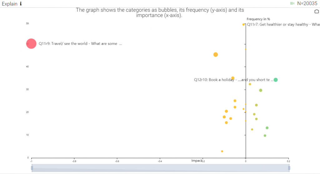
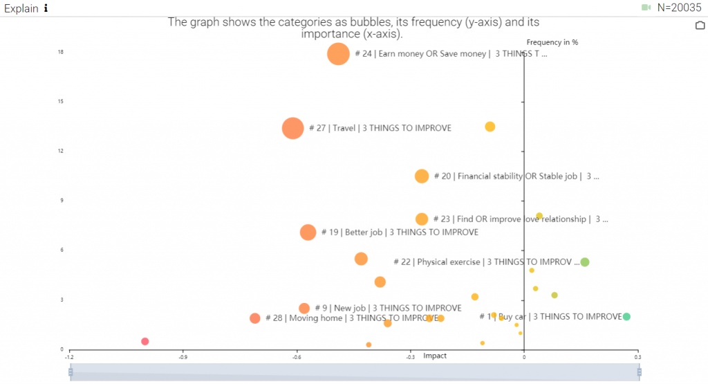
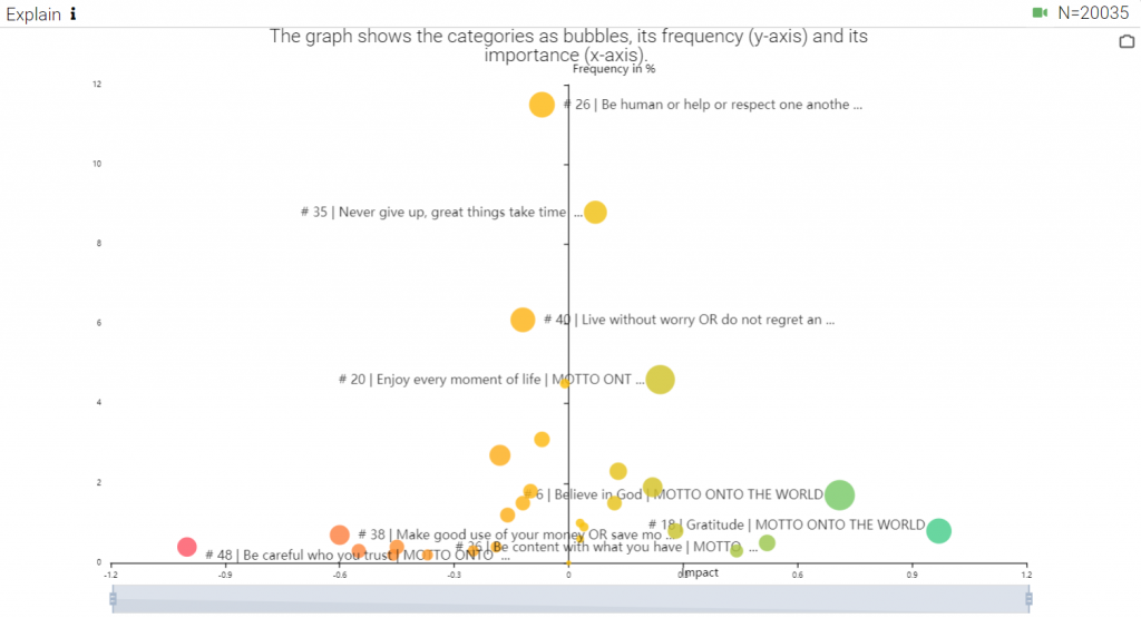
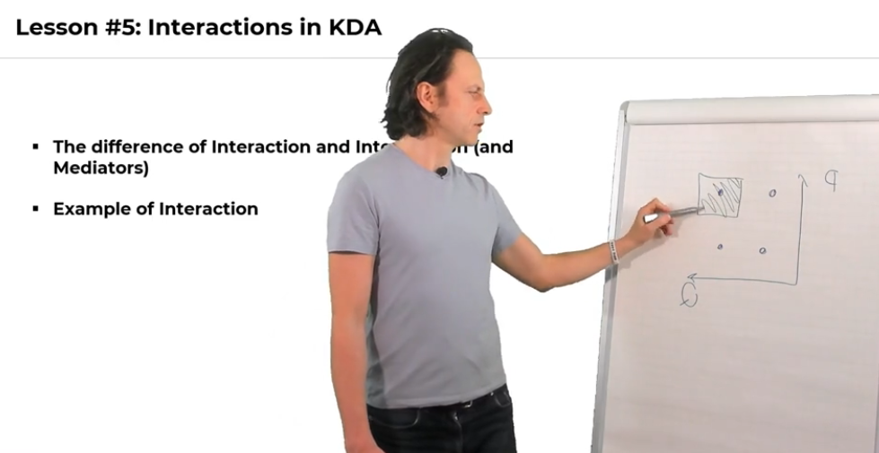
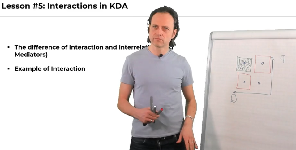
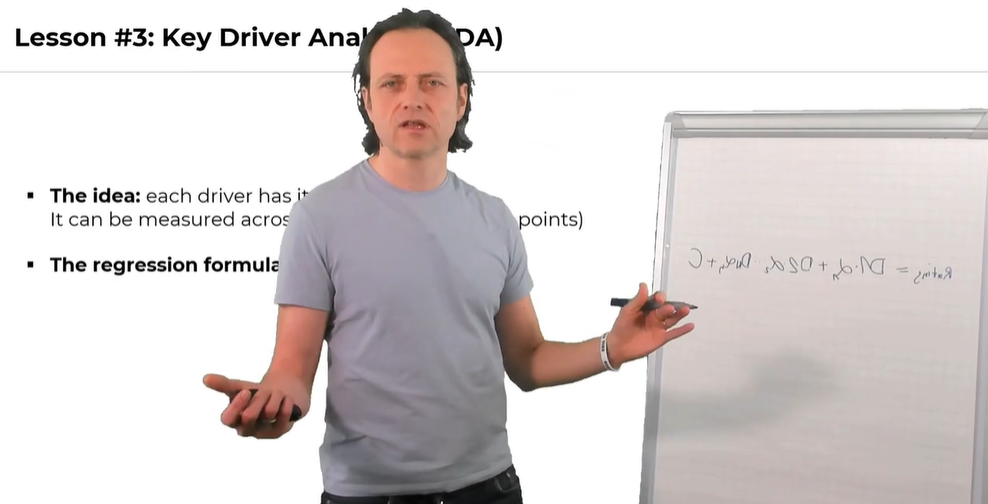
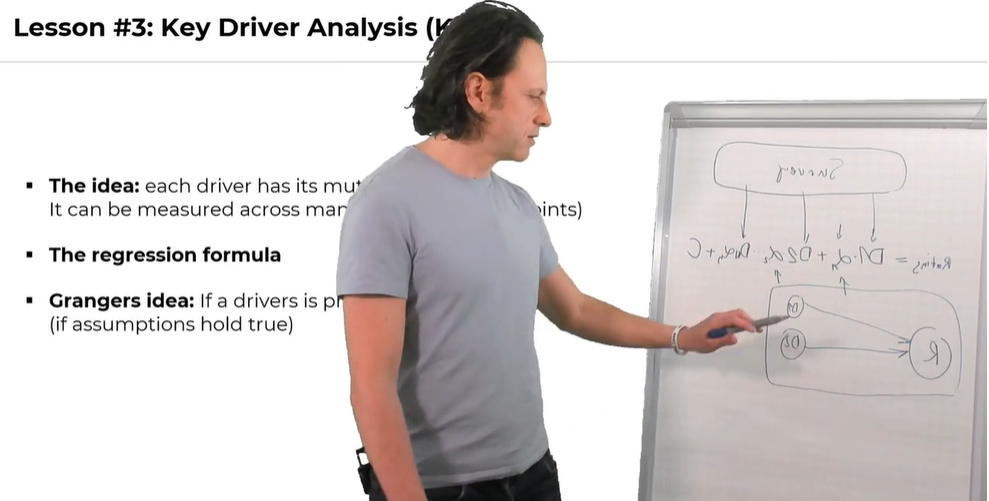
  1. DRIVERS: Driver analysis on customer topic to drive NPS

Now we need to understand the relevance and impact of what customers say (customer topics) and the impact on loyalty and respective outcomes.

All this is well explained in my article Predictive Qual . It’s a process that simply uses the data you already have.

When you are now think “ok, but we kind of have this already” then please take a look at this article. Way less than 5% of the corporation today do it the right way.

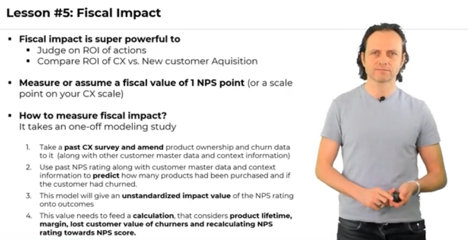
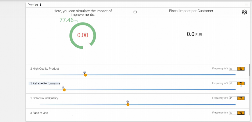
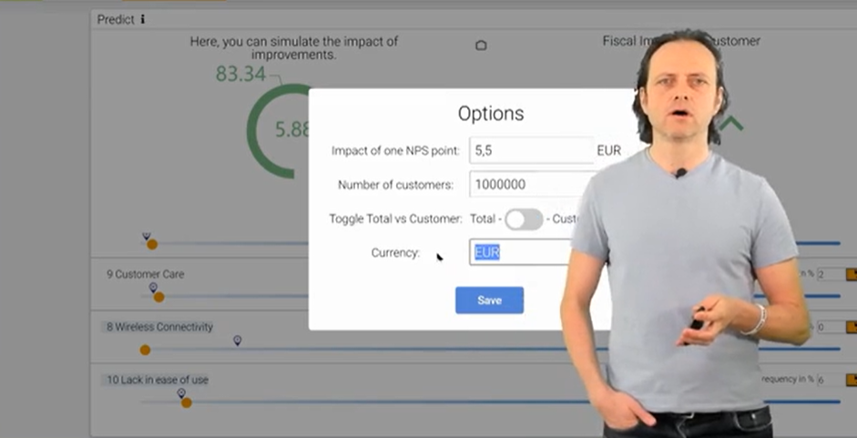
  1. IMPACTS: Modeling to measure the unique impact of NPS on customer value, revenue, churn, and costs

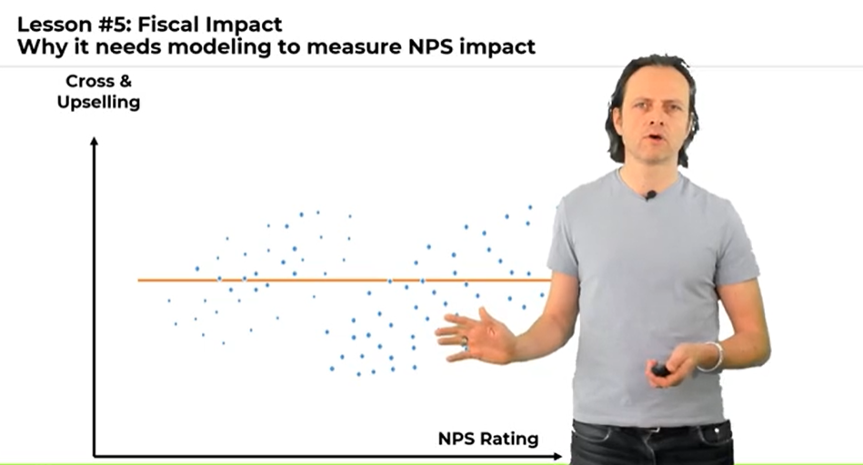
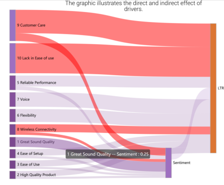
At the end, nobody cares about NPS points. What counts are profits, revenue or cost figures. You need to build the link between the CX measure and fiscal measures.

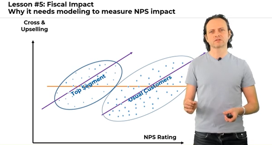
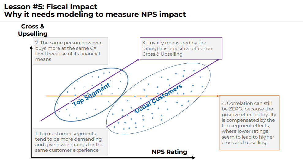
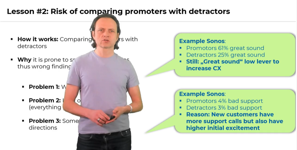
It seems obvious how to do it. Just take a look at how much promoters buy more, churn less, and create fewer costs. If you try this out too often, it shows no correlation!

This is the lesson taught in the first-semester statistics class: spurious correlation does not prove causation.

Modeling helps as customer profile data typically help to clean out cofounding biases and to measure the true impact of NPS.

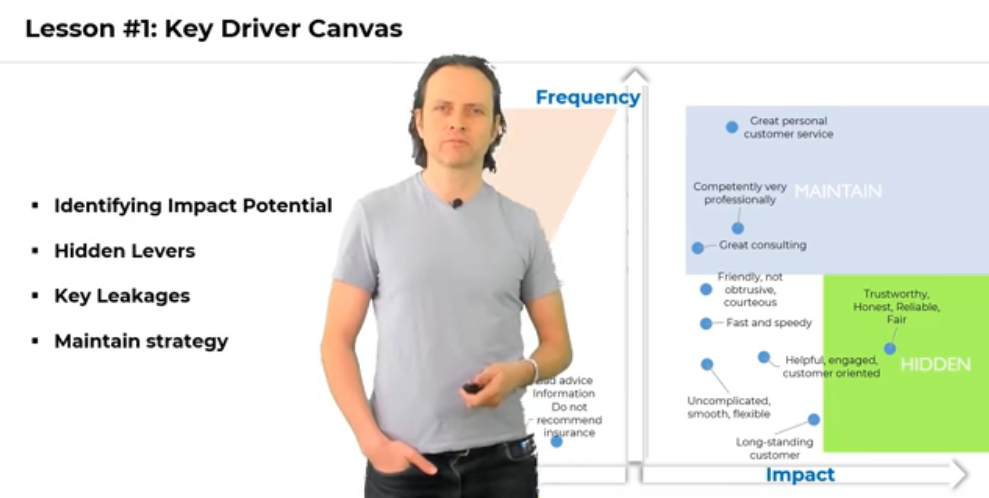
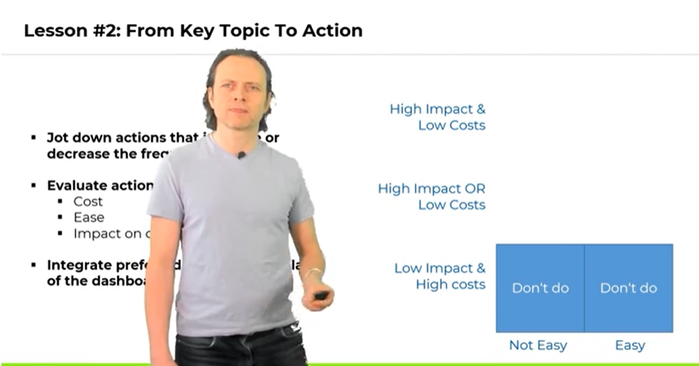
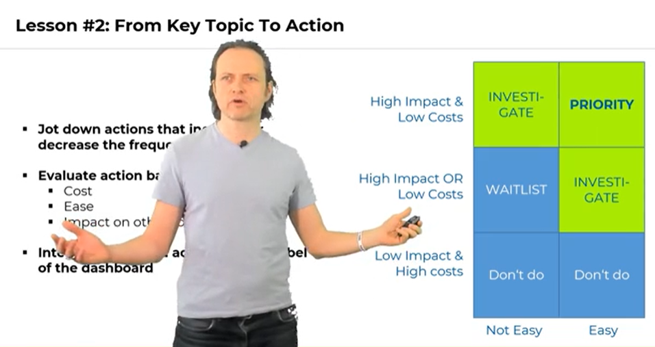
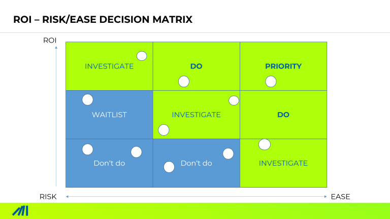
  1. MATRIX: Tie it together in an ROI-RISK decision matrix.

Thru steps 1 to 3 we have it all to make informed decisions.

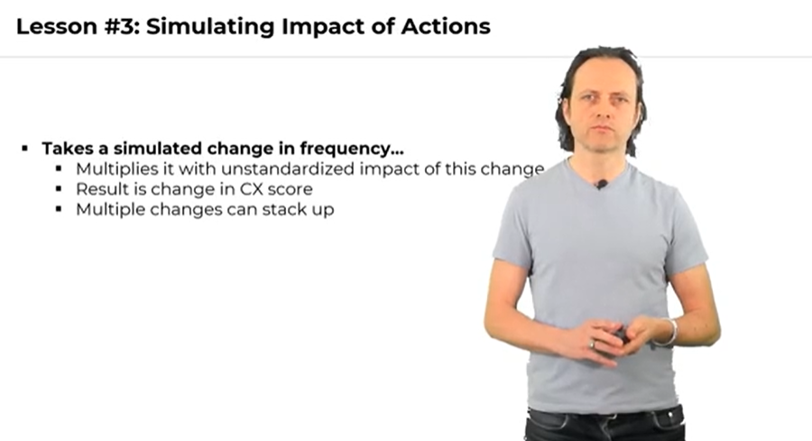
We can simulate the impact of hypnotized actions onto the bottom line (RETURN ON…). We have estimated the needed investment (… INVESTMENT) and defined the risk or ease of that action. This enables us to put everything in a decision matrix with this norm strategies:

  • DO IT – High ROI, low risk
  • EVALUATE – High ROI, medium risk or medium ROI, low risk

WAIT – all other combinations.

All You Need To Know To Get Started

To gain leadership buy-in, you need to speak the language of the senior leadership. In other words you need to cater to their interests. These interests are called “revenue”, “profit” or “costs”.

Moreover, it would be best if you answered the very “simple” questions they care about “What should we DO” to cater our interest (=profit, cost, revenue,…).

To be convincing its not enough to present insights. This is not interesting! It does not directly answer the question posed.

To answer the question, we need to model the link quantitatively from action to result. The ARIM framework paves the way.

Dozens of enterprises are already applying ARIM with great success. Just like this Swiss insurance, that simply did it because it sounded to be the right thing.

Find out how it can work for you

More in-depth background gives our CX Analytics Masters Course – which is free for enterprise professionals.

Apart from this, I am always interested in an exchange with readers. Send me an email or ping me on LinkedIn – always love to have a professional conversation on CX and to answer question

Frank

"CX Standpoint" Newsletter

b2

Each month I share a well-researched standpoint around CX, Insights and Analytics in my newsletter.

+4000 insights professionals read this bi-weekly for a reason.

I’d love you to join.

“It’s short, sweet, and practical.”

Big Love to All Our Readers Around the World

The Better Alternative to Benchmarking

The Better Alternative to Benchmarking

Founder of CX-AI.com and CEO of Success Drivers
// Pioneering Causal AI for Insights since 2001 //
Author, Speaker, Father of two, a huge Metallica fan.

Author: Frank Buckler, Ph.D.
Published on: July 23 2021 * 3 min read

Senior management loves benchmarking. They ask for it. With this, they do not do themselves a favor.

Yes, it provides an easy answer to the ultimate question, “Are we doing good or bad”. Yes, it provides relief when you meet the benchmark. And: Yes, it gives incentives to meet competitive performance.

So, what’s the problem?

Get your FREE hardcopy of the “CX Insights Manifesto”

FREE for all client-side Insights professionals.
We ship your hardcopy to USA, CA, UK, GER, FR, IT, and ESP.

Benchmarking is Dangerous

Professor Byron Sharp conducted the largest cross-vertical study to date on understanding drivers of loyalty. What he found was devastating.

The main predictor of loyalty and churn is simply the market position. Each brand might have individual factors, but this simple mechanism explains the bulk of variance across verticals.

When you look at benchmarking studies, you may feel an “aha” moment right now. The most significant player not only has most likely a good CX score but also performs exceptionally well in most drivers. There is an implicit bias based on market dynamics and psychology.

Benchmarking assumes that your CX KPI is somehow comparable – so that the player with the higher score is performing better. This assumption is broken in many ways.

You mostly do not own the same type of customers. Some customer segments are more critical in giving ratings while still showing the same loyalty. The customers you own differ also in what’s important to them.

Even if the best competitors would be comparable, benchmarking does not answer the question “What is possible” , so it does not answer the question “what’s is good” in absolute terms.

This exposes companies to multiple risks:

  • RISK #1: False signals of performing well: If you overperform competition, you will be satisfied, and there is no reason to improve further.

  • RISK #2: Wrong benchmark due to serving up different customer segments: This is further problematic since the benchmark is typically biased, thus wrong.

  • RISK #3: False signals of performing weakly: These signals causing the blame game and even giving no information on how to become better.
In a nutshell

Benchmarking uses a broken comparison, gives you illusory security of performing well, and false warnings of performing week.  On top of that, it does not provide what everyone thinks it does: a measure of “what is good or bad”.

Join the World's #1 "CX Analytics Masters" Course

Free for Enterprise “CX-INSIGHTS” Professionals

LOOK IN THE MIRROR – THIS IS YOUR COMPETITION

Let’s take a step back. What is the use of knowing whether you are doing well or not?

Sure, you then know whether you have room for improvement (if you are very lucky).

Fine. But you still do not know how to leverage the potential.

Here is the alternative. Do this, and you don’t need benchmarks:

  • Know what you need to do to improve (find most critical next actions)

  • Model how much improvement is possible with a particular investment.

  • Then do it, if there is a clear positive ROI.

If you have this process in place, then it is IRRELEVANT, what your competition is doing.

Just do your very best. It is the only thing you can do anyways.

Look into the mirror. This is your competition.

Yes, this is not sci-fi. The methods can be found in state-of-the-art CX-Analytics toolboxes. For instance this training teaches how to implement it.

Keep Yourself Updated

On the Latest Indepth Thought-Leadership Articles From Frank Buckler

This is your alternative to Benchmarking:
  • Know what’s important by using Causal Machine Learning. This is all you need. It works even by leveraging your customer’s text feedback

  • Stop the blame games played based on arbitrary targets, instead set stretched targets on key drivers

  • Constantly challenge yourself and establish a “The sky is the limit” mindset.

Questions? Not the same opinion?

Challenge me!

Frank

P.S. these resources might be helpful to get into benchmarking alternatives

Correlation is not Causation

Predictive Qual

"CX Standpoint" Newsletter

b2

Each month I share a well-researched standpoint around CX, Insights and Analytics in my newsletter.

+4000 insights professionals read this bi-weekly for a reason.

I’d love you to join.

“It’s short, sweet, and practical.”

Big Love to All Our Readers Around the World

Fixing the INNER LOOP BIAS

Fixing the Inner Loop Bias

Founder of CX-AI.com and CEO of Success Drivers
// Pioneering Causal AI for Insights since 2001 //
Author, Speaker, Father of two, a huge Metallica fan.

Author: Frank Buckler, Ph.D.
Published on: July 9, 2021 * 5 min read

Sometimes friends ask me what do I do, and then they ask what is customer experience research is for? The simple answer I give is that employees dealing with customers should get feedback on how the customer views the experience. Only this way they can learn and improve.

Simple, isn’t it? This idea is also referred to as the INNER LOOP. It is contrasted with the OUTER LOOP, which tries to initiate learnings from feedback and conclude strategic initiatives for change.

The Inner Loop is set up to make customer-facing employees learn how customers perceive them, give them praise in case of great feedback, but also give an opportunity to follow up with detractors and complaints quickly.

All this is meant to enable the company at the level of the frontline workers to improve.

Get your FREE hardcopy of the “CX Insights Manifesto”

FREE for all client-side Insights professionals.
We ship your hardcopy to USA, CA, UK, GER, FR, IT, and ESP.

The Inner Loop is Broken

For years I just dealt with the outer loop because the inner loop seemed to be simple and working well. Just recently, I learned that I could not be farther from the truth.

Here is the problem. The idea behind the inner loop is that human reads feedback and learns from it. But this idea is broken for THREE reasons:

REASON #1 – The RAS Filter

Whenever I plan to buy a new car, suddenly everywhere on the streets, I see this car. Suddenly, everyone seems to drive it already.

The reason is a small part of your brain called the Reticular Activation System (RAS). RAS is a bundle of nerves at our brainstem that filters out “unnecessary” information so the important stuff gets through.

The RAS is the reason you learn a new word and then start hearing it everywhere. This is why you can tune out a crowd full of talking people yet immediately snap to attention when someone says your name or something that at least sounds like it.

When reading dozens or even hundreds of feedback, our RAS is bringing those feedback to special intention that somehow caters our personal interests.

A waiter who is frustrated with unpleasant people he needs to serve, will more than others notice complaints as proof of their rudeness rather than looking for ways to satisfy them.

People learn what they want to learn, not what they necessarily need to learn.

REASON #2 – The Frequency-Impact-Illusion:

The most often mentioned reason for the loyalty of speaker users is “great sound”, It is intuitive for us to believe that this is the most important reason, thus the most important thing to further work on.

When using proper cause-effect modeling techniques, you learn that the importance of mentioned topics is hidden and typically NOT correlated with the frequency.

Actually, there are many known mechanisms that explain why this makes sense. First of all, customers “just talk”. They do not have an incentive to be 100% correct and precise. Typically people respond with strongly associated topics that make them talk. As Daniel Kaneman said it “Human brain is like cats. Cats can swim, but avoid it if possible”. Human can think, but if possible, they avoid it because it is exhausting. Even worse, customers are not 100% aware of what drives their own behavior.

This is why when you scroll thru your customer feedback, you will learn the WRONG things because you are primed to believe, frequency means importance.

REASON #3 – Resistance to Critique:

Everyone knows the basic rules of giving feedback. Always start with the good things. It will make the recipient open for critique.

If everyone knows this – why on mother earth are we still taking customer feedback like a dumpster full of thrash and pour it over our frontline coworkers – then expect them to learn productive things from this?

What’s your take? Knowing that people just learn from reading what they want to learn, knowing that what they learn is fooled by its frequency, and knowing that the random sequence of critical feedback sparks more resistance than change.

Knowing all this, does it still make sense to send your coworker the customer feedback verbatims with a kind note “please read“?

Join the World's #1 "CX Analytics Masters" Course

Free for Enterprise “CX-INSIGHTS” Professionals

The INNER LOOP BIAS FIXER™

Here is the promise. With the proper method, you are delivering feedback to the front line so they can:

  • Learn what is important and help them to get out of their bubble of own interest.
  • Thoroughly enjoy the praise they get and deserve
  • Improve frontline workers’ behavior personally by letting them accept critique and focusing on what’s truly important for customers.

The solution requires three things:

First, it is mandatory to institutionalize a modern CX Analytics system. At its core, what it takes is at least:

  1. A) A text analytics system that quantifies the unstructured customer feedback.
  2. B) It needs a proper key driver analytics top of this data that reliably measures the impact and importance of those categories.

Second, by sequencing first the positive, praising comments, you comply with psychological feedback rules.

Third, by batching feedback into important and less important categories, you can help readers to read important feedback first. This automatically frames and primes learning the right way.

The “INNER LOOP BIAS FIXER”-Method works like this: Delivering sequenced feedback in importance-batches:

  1. Praise on TOP IMPORTANT topics
  2. Critique on IMPACTFUL topics (=Importance X Frequency)
  3. Other Praise
  4. Other Critique

Keep Yourself Updated

On the Latest Indepth Thought-Leadership Articles From Frank Buckler

In a Nutshell

The Inner Loop is meant to enable frontline workers to learn and improve, but this mechanism is broken for three reasons.

People learn from feedback what they want, not what they need. They are fooled by the frequency-importance-illusion, and wrongly sequenced critique makes them less likely to accept critique.

Delivering sequenced feedback in importance-batches is a viable solution. It requires a reliable solution to measure the importance of topics.

The latest systems that combine deep-learning text analytics with causal machine-learning were superior to out-of-the-box solutions.

They deliver 4X higher impact of actions and are thus advised to guide the inner loop process.

CX.AI is such a solution that pioneered this technology. You can even contact CX.AI specialists and get a free consultation.

Your thoughts?

Frank

"CX Standpoint" Newsletter

b2

Each month I share a well-researched standpoint around CX, Insights and Analytics in my newsletter.

+4000 insights professionals read this bi-weekly for a reason.

I’d love you to join.

“It’s short, sweet, and practical.”

Big Love to All Our Readers Around the World