How to Analyze Customer Feedback the Right Way?

Founder of CX-AI.com and CEO of Success Drivers
// Pioneering Causal AI for Insights since 2001 //
Author, Speaker, Father of two, a huge Metallica fan.

Author: Frank Buckler, Ph.D.
Published on: May 18, 2021 * 9 min read

Businesses are constantly dealing with data; however, raw data is not insightful if not neatly organized. I would say, there is nothing more powerful than getting to see your brand through the eyes of your customers. 

However, if you receive thousands of NPS responses, sorting through the received feedback becomes challenging since there is too much feedback to analyze manually, no consistent criteria to rely on, and lack of granularity involved.

Nevertheless, any feedback received from your customers is an incredible opportunity to take action and convert weaknesses into strengths. NPS analysis will make it easy for you!

Get your FREE hardcopy of the “CX Insights Manifesto”

FREE for all client-side Insights professionals.
We ship your hardcopy to USA, CA, UK, GER, FR, IT, and ESP.

The 3 Pillars of CX Analytics

In previous blog, we discussed how you gather your data and what kind of data you are gathering. And now it’s time to make use of it. And most of the used cases you already know. It takes data compute, the NPS score you report to, so you slice it down into different times, segments, regions.

This is not what I’m talking about. This is a conventional stuff. This is even not analytics. This is just dashboarding. So the framework has three steps. And the first crucial step is to quantify and to categorize the unstructured text feedback you get. And as we previously mentioned the core part of customer experience serving that you get unstructured text feedback because it’s much faster and it’s so rich. This needs to be done!

It’s still a bit surprising… Most companies don’t do anything about it. They don’t read it or send it to the front line. That’s the feedback you got lost it last week. They read it. But other than that, it’s seldom that companies quantify the news.

It was quantified might mean more than the word clouds, because word clouds do count words, but not meaning. Thus, they are not very useful.

STEP 1 categorizing unstructured text fit because only if we make numbers out of it, we can analyze it.

STEP 2 is once we have categorized, once we have quantified what people are saying, we can start understanding how important they are. That’s one key thing to elaborate a bit more here.

STEP 3 is to take all these insights, quantification, impact and use it… Enable. Conclusions enabled actions from that. This takes some additional work. Different features you can do and I will quickly show you some of them. So let’s go and talk about step number one.

Join the World's #1 "CX Analytics Masters" Course

How To Manage The Unstructured Feedback

Categorizing – there are three ways of categorizing on spark picks and the typical way is manual categorization – that’s what market researchers know. Because they don’t want to do it because lots of work. Someone needs to manually go through every single line through thousands of lines and third, a code book where you say, okay… That was a burden.

It’s a lot of work. it’s useful of course but not scalable. If you have thousands of feedback, it just costly. And there are better ways to do it. Because the most important thing is that they can do it. And if you leave it out because you don’t have the resources or the budgets to do it, you at least need to think about an alternative.

The alternatives are unsupervised categorization, supervised categorization. These are two kinds of AI that deal with that and they have both pros and cons. At least when it comes to manual coding and supervised coding, you need to think about the category definitions and labeling conventions.

Because you as a researcher are responsible for building the code book which is a pro, because you can design it to your needs based on your domain knowledge. But again, work… Which you don’t have to do with unsupervised learning. So in this category, you can also build in hierarchy.

There are some dos and don’ts for that too. another topic which is important is how can you make sure that you will spot new categories, new topics popping up over time? that’s something we will elaborate a lot a bit later in the following blog posts. Also this is very important – managing consistency.

Each of those three methods, manual, unsupervised and supervised categorization have different challenges. And it is something that’s been overlooked because how you make sure that if something is categorized as quality, good quality does really mean good quality… And it doesn’t mean all the time.

And also in the next wave, it has the same meaning. That’s very important because otherwise you cannot compare. Because the unstructured feedback is not a standardized input. if you categorize it, at least this step needs to be consistent. Another challenge is really how to deal with multiple languages.

You can aid or translation services. And then you choose one core language, or you do all this separately with native coder and so forth. There are pros and cons as well for that also there is a topic of sentiment, which we will elaborate later on. So which means it’s verbatim.

Is it positive or is it negative and how much positive? How much negative is it? how much emotional is it positive and negative? This is an emotion, this is an information which goes beyond categories and which can be very useful. There are various specific things you need to know about sentiments to go into a discussion within the organization and to defend the right approach. Lastly, we will talk about ways to do video validity assessment: accuracy, consistency… Accuracy is better. It’s correctly coded. Consistency is it’s always coded at the same time. And the predictive power is that it can be used to predict outcomes and there’s and you can expect that categories that have predictive power. This is an indication that they are true because you can categorize correctly, always the same time, same way I can do consistent way, but still wrong. And if it’s wrong, it’s not predictive.

(Stay tuned to learn more about these topics in the upcoming blog posts)

How to Understand The Relevance of Topics Raised by Customers

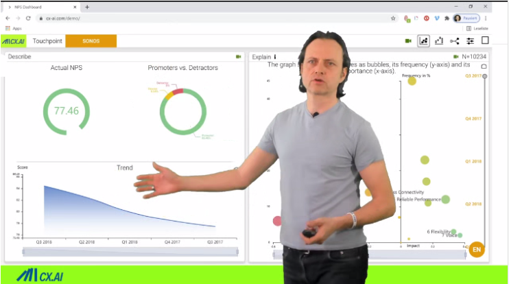
The other step too, in the analytics framework is to identify the impact of the categories. What you see here are these two dimensions. In step one, we categorize everything in categories, which are the bubbles that you can see here.

Frequency – you can if you categorize the verbatims, you can count all Y 20% saying. Great personal service – you can say that. And that’s the outcome of the step one which is counting frequencies and you would expect the discounting gifts. You what topics to work on because I mean, you are asking your customers, Hey, why did you give this rating?

They say… I mean the speakers, they have great sound or the service is good. That’s what they say the first time. And when you ask an insurance customer, for instance, but it turns out that this is you lose me on not correlated with the importance of the category, which is very interesting. That’s why we need step two. There are several reasons for that, which we elaborate in the upcoming blog post. So there is resist impact frequency, illusion. We implicitly assume the most often mentioned topic is the most important one, which is simply not true. And just to give you an example…

Here’s an example from insurance – not so many customers say, you know what  I am lacking to recommend because this insurance company is trustworthy, honest, reliable, fair, you know, these kind of sayings. It’s probably a pretty good reason to be satisfied and to recommend your insurance.

And that’s why it’s very likely, or it’s plausible that this has big impact. But not so many people saying it. So why you are not so good at it, you should improve. So this logic tells you that the frequency is not your measurement of what you should do next.

There are these independent things, what they, how often they mentioned things and how impactful they are and this impact needs to be calculated the right way. Typical of the first idea which researchers have is that there’s some you say, oh, that’s right. We need to understand what’s important.

So let’s look what the promoters say, then have a look what detractors say and let’s compare that because when promoters say something different than detractors, that’s probably the reason. And why this may sometimes work. It often doesn’t work. And it is because  you would simply look at correlations and correlations, often spirits.

To give you an odd example. When you look at the shoe size of employees in a company the shoe size very much correlates. Was he likely to get to the C-suite? Why? Because men have larger shoes, and for some reasons they are more likely to become a CO or a C-suite. That’s the effect.

And the shoe is some correlation with something else and if you see what you’re measuring now, service, great service, friendliness  or staff is knowledgeable. All these things relate somehow together. Thus, building your insights on correlation is dangerous.

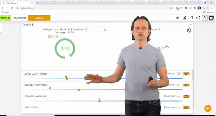
And you don’t want  to build on your strategic initiatives to drive on spirits findings. it is easy to do better. And what comes to your mind probably to measure impact is key driver analysis. I mean, key driver analysis, typical methodology. There are of course, many different ways to do it.

To understand the impact of different drivers – that is the method. If you have multiple reasons for success to find out what’s the contribution of each of them. So you need some kind of analytics around key driver analysis. So there are of course  elaborations you should consider, and we will go in more details later.

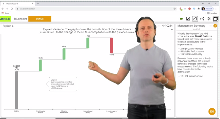
Afterwards, one is a non-linearity, especially when you have a sentiment and you want to understand impact. We see that positive side of the sentiment has lower impact and the negative side. So this is called and non-linearity just an example. So you want that your key driver analysis can model that. I’m just saying that because the convention key driver analysis is basically regression, which assumes the guarantee and independence of drivers and direct impact. So these are the other examples, for instance, interaction, and interactions when you need both, when you need to pray surprise and the product quality only if customers whose praise two things at a time. If this then is impactful, then those two are interacting. They’ve of course interactions as well, you could say only if the quality is great, but there is something else for instance, that the customer is complaining about something.

If this is not there then there are different fields of different ways of interactions, but these interactions, you really don’t know them beforehand. So you want to have a key driver which can spot those interactions. Because the total analysis will make more sense at the end.

It will be more predictive. Another thing you want in a key driver now is to consider mediators. So sounds complicated, but let me give you an example. So for instance, we did this exercise for company who rents out flats and they asking their vendors, what’s your likely to recommend us.

And the most often mentioned topic is and most of mentioned, reason for liking the flat is, a great location. So it turns out it’s also very impactful, but there are other things like the flat has surrounded garden. There’s not a highway next to it.

These kinds of signs are influencing, driving the great location. So there is a mediator effect. That’s a methodology approach that of course the garden and the lack of highway next to your flat is very important, but you cannot see it in a driver analysis because it has an indirect effect through a mediator.

That’s what the key driving should consider. And we will talk about ways to validate all those approaches.

Keep Yourself Updated

On the Latest Indepth Thought-Leadership Articles From Frank Buckler

This is How You Draw the Right Conclusions from CX Insights

Let’s talk about step number three, which is enabling those two insights.  The insight of – thank you. You get to quantify your text feedback measured in the frequency that you then infer the impact of all those topics.

This needs to be now analyzed and structured and transferred in strategies. So, and what you see here are already three fields, which are the typical things to do. So first we have a field and norm strategy called hidden levers. So these are topics that are very important, but not very frequent.

They are hidden because you would not have noticed them in conventional analysis, but just looking at frequency, you do not spot hidden drivers and they are important because obviously there is a huge opportunity to improve and next time, get more customers mentioning it.

That’s strategy one – improve hidden levers. Second is key leakages. The key leakages are negative categories that are important and frequent enough. Why? Because the gnome strategy for leakages for negative things is bringing them down to zero. So either you have something that’s super often mentioned, but not so important.

It can still be interesting to bring it down, although it’s not so important because it’s so often mentioned it can be relevant to bring it down. It’s also relevant to bring it something known, which is super negatively important. But it’s media has some medium level of frequency. That’s obvious.

And then we have the maintain strategies. These are levers, which are some kind of important. We’re also good with it because they are often mentioned. You want that they are not forgotten, You don’t want that your organization go and say, you know what? It’s not a key, we don’t need to do it.

That’s not the result of the analysis. As a result of the analysis is if you want to improve, you should stay as you are, but improve here. And maintain this one is a key every year. The next thing you need to think about is how you convert versus how you then decide what to do. And because the topics just tell you what customers say, don’t say which actions could drive and improve them. So what we recommend is that you list these other categories and the potential actions behind it. And sometimes there are topics which share an action. Then you can combine them. Now, one action could improve in several topics. That’s an important exercise to do.

What you can also do now with the model behind that and the model that creates and gives you the impact, enables you now to do something. You can simulate how much will the NPS improve if I improve this frequency, that’s an important exercise that makes it tangible to your business partner. So I’m going to show you an example right away. Same thing is for the question, why did say NPS changed towards  last time? That’s typical Q&A in companies where it changes, but suddenly you don’t know why. And what companies and people are doing they look at okay.

What kind of categories changed and then everyone who looks at it picks those categories. They the like best. But that’s not how you should do it. The change in the NPS can be attributed mostly to the changes of important categories. Yes, if an important category changes, it has obviously a much higher impact to NPS.

And this is a simulation exercise you can do, and it gives you much more guidance on what happened in the last quarter.

And lastly, very important to then finally when you kind of think of what to do, which actions to take, you need to consider the costs of those initiatives and mirrored to the ROI. Let me now, show you an example of how this can look like in a tool on a dashboard.

You can imagine…

Let’s have a quick look in an implementation example. So this is a dashboard which shows these metrics with frequency and impact on the different topics you see as bubbles and the dashboard can have typical descriptives what’s NPS today. What’s it, what’s development and so forth. So that’s how you can visualize it.

And you can label the hidden levers as well as the key linkages. So now then you can also with the same information, you can build a simulator. So you, you see all the different topics. You just scroll down and see different topics. And for instance, your reliability of performance, you have a slider, you improve it and you can really see that.

The NPS will improve by 3.7 points. This is what you can simulate based on your key drive analysis findings. What you can also do is if you are quantifying, what is the impact of one NPS point, you can measure the impact of those actions. Euro dollar, whenever a  currency.

And this knowledge of what the impact of one NPS point to the bottom line is something we, in the first place we draw from experience from, past data, we can have an estimate, which is of course pretty rough, but it’s the possibility to use separate data to really find out the link between NPS.

And bottom line and we will discuss this in another class. How exactly you can do that. and this is the analysis I also talked about where you do the simulation. I did the NPS change from last time to this time, and sometimes even it didn’t change. But you improved a lot in certain categories, but you don’t see change because the improvement, in other areas  are negative because you got worse in other areas. So it really can boil down what are the key reasons for the change? and where did you really improved? So, because in categorization you have 50 different categories to look at and really to boil it down to three, four, things is very useful argumentation or discussions on what to do next.

This is just an example how you can visualize those and. This really focuses the discussion. It helps very much to drive the right decisions and to focus on, very few actions and initiatives.

In a Nutshell

The framework of analytics is threefold first, most important. You need to quantify, you need to categorize your customer feedback. It’s the one, but this is not enough because you really need to understand what’s the predictive power. What’s the causal power of what people saying.

Sometimes they mentioning things just top of mind is a really need to understand. Is it worth to work on it? This is what you do in step two, identifying the impact of each and every category and topic and third, all this information needs to be structured, to support and guide the right decisions. And I’ve given you a dashboard example about above.

We will again elaborate further on the similar topics in the following blog posts.

"CX Analytics Masters" Course

b2

P.S. Would you like to get the complete & interactive FREE CX Measurement Guidance for your business in 2021?

Simply subscribe on the free
CX ANALYTICS MASTERS” course below and enjoy the above-mentioned training guidance in its Class # 2.

“Solves key challenges in CX analytics”

Big Love to All Our Readers Around the World

IMPRINT
Our Group: www.Success-Drivers.com

Privacy Policy
Copyright © 2021. All rights reserved.

FOLLOW CX.AI